LUZI: Brand Design for 100 Years of Fragrance Expertise
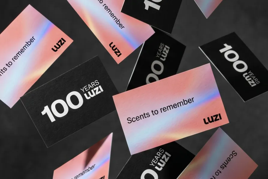
Following the strategic refinement, the next step was to translate the strategy into a distinctive visual identity. The new brand strategy became the foundation for a design system that makes LUZI’s identity visible, consistent and adaptable across applications. To mark its 100th anniversary, LUZI received a refreshed visual identity that brings together its Swiss heritage, international relevance and the emotional power of fragrance in a distinctive brand world.
A Brand Takes Shape
Over the decades, LUZI has grown more international, more complex and more multifaceted. What had long been felt within the company now needed to become more clearly expressed through the brand. The task was not to create a new identity, but to distil and sharpen the existing one through design. Branding was therefore understood not as an aesthetic layer, but as an expression of the brand’s attitude and character. The guiding principle was clear: LUZI would not become louder, but clearer. Not a break with the past, but a refinement. Not staging, but a considered, pared-back system that comes to life through typography, imagery, colour and application.
«Design is never an end in itself. It makes brand strategy visible. Only when attitude, values and design reinforce one another does a brand emerge that people recognise and remember.»


A Design That Brings Fragrance to Life
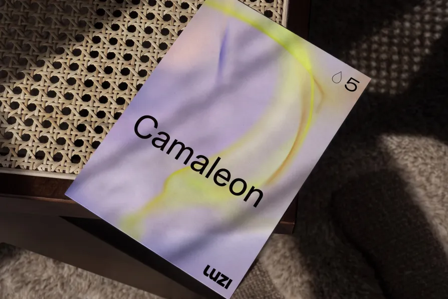
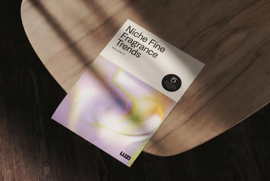
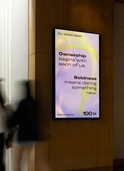
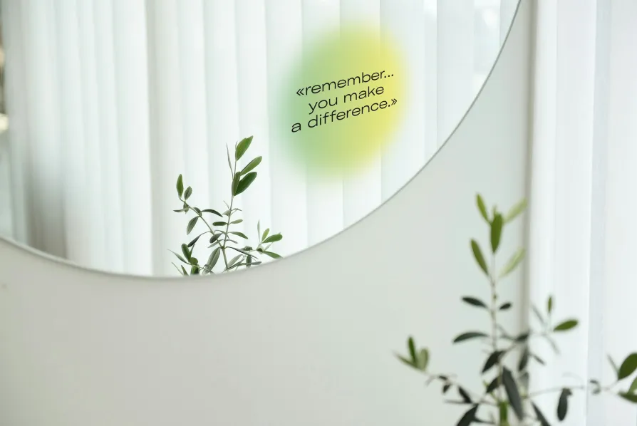
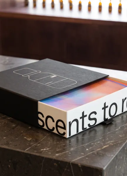
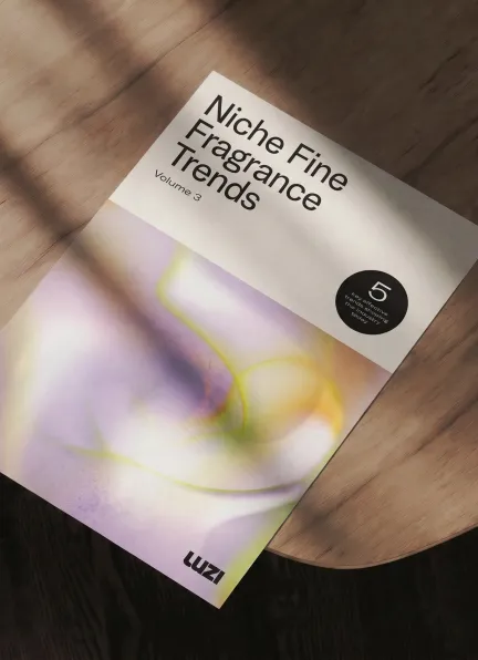
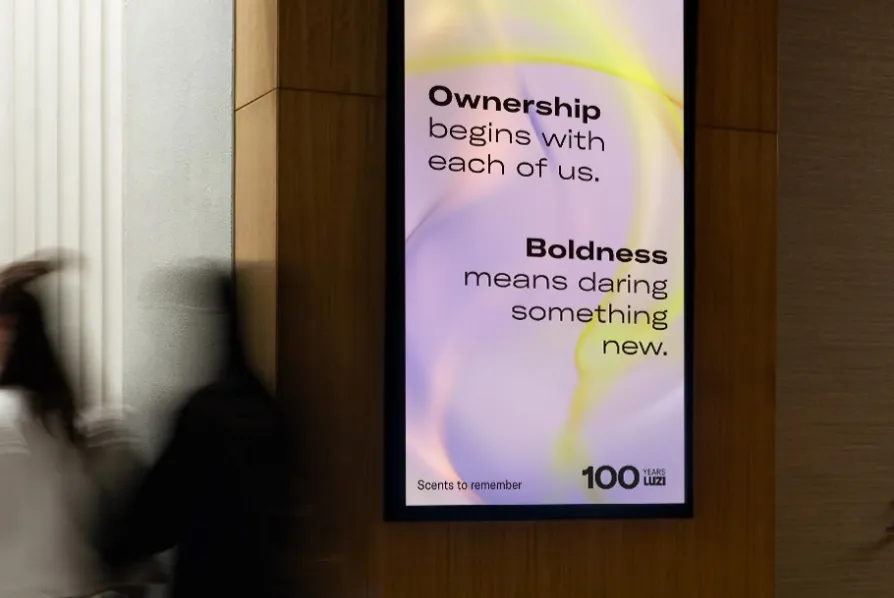
The claim «Scents to remember» became the foundation for a visual principle. Rather than simply illustrating fragrance, the aim was to make it an experience. The abstract key visuals give the world of fragrance a distinctive visual expression. Soft gradients, light, depth and organic forms create a visual language that combines precision with emotion, giving the brand an unmistakable character. Design becomes more than decoration; it takes on a sensory and strategic role. It translates something as intangible as scent into a visual language that stays with you.
Clarity as an Attitude
Typography, colour and imagery follow a shared logic, consistently translating the brand identity into a calm, refined and flexible visual language. At the heart of the new brand world is a precise typographic system. GT America provides a clear stage for stories, fragrance worlds and content: understated, highly legible and distinctive. The colour palette is deliberately restrained. Black, white and off-white dominate the typographic system, while colour is introduced primarily through imagery, key visuals and carefully considered accents. The result is a brand presence that feels confident rather than loud. It provides clarity and orientation without overstating the brand’s emotional character.


From Brand Essence to Design System
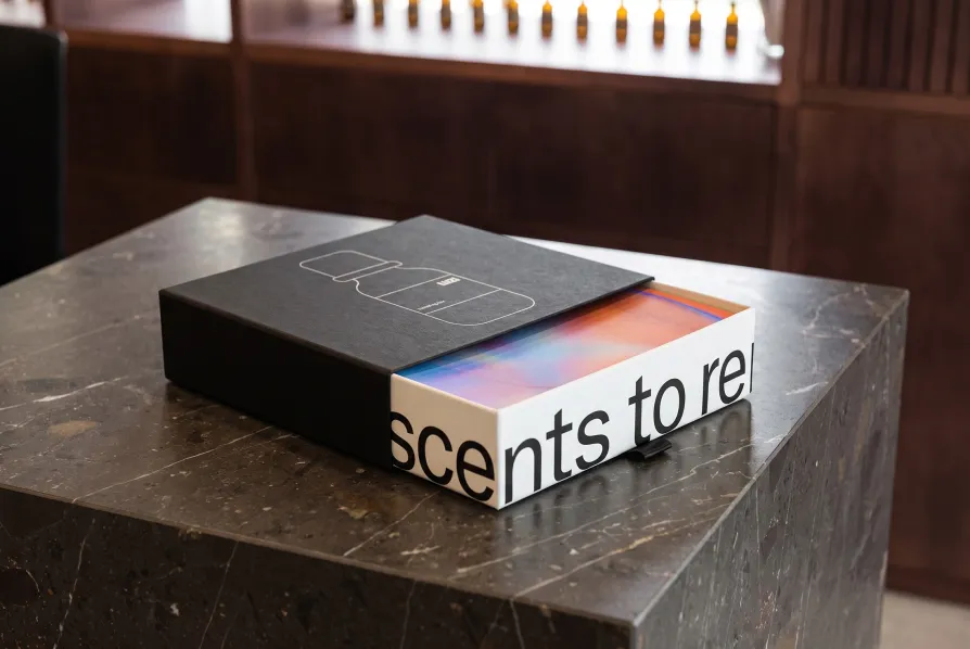
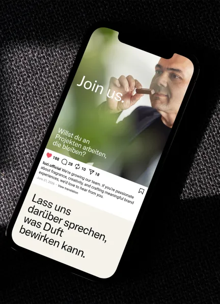
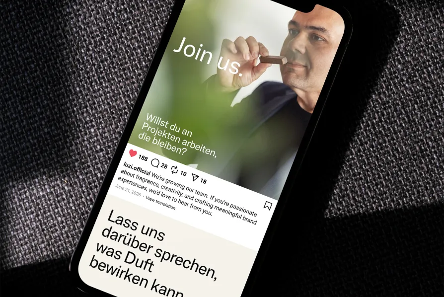
The visual identity was not created solely for an anniversary, but as a long-term design system. Rather than prescribing a rigid visual framework, it establishes clear design principles that can be applied flexibly across a wide range of touchpoints – from the website and digital templates to presentations, factsheets and booklets, as well as business stationery, packaging and fragrance bottle labels.
The key was finding the right balance: a brand presence clear enough to create recognition, yet open enough to accommodate different content, fragrance worlds and formats. Typography, imagery, colour and key visuals follow a shared logic, creating a consistent brand world across every touchpoint. Rather than defining every individual application, the design system establishes the principles that guide how new applications are created.
The design system provides direction without restriction. It creates consistency without becoming rigid. And it makes visible what lies at the heart of LUZI: fragrances that move people. Memories that last.
All visuals shown are representations of the design concept.